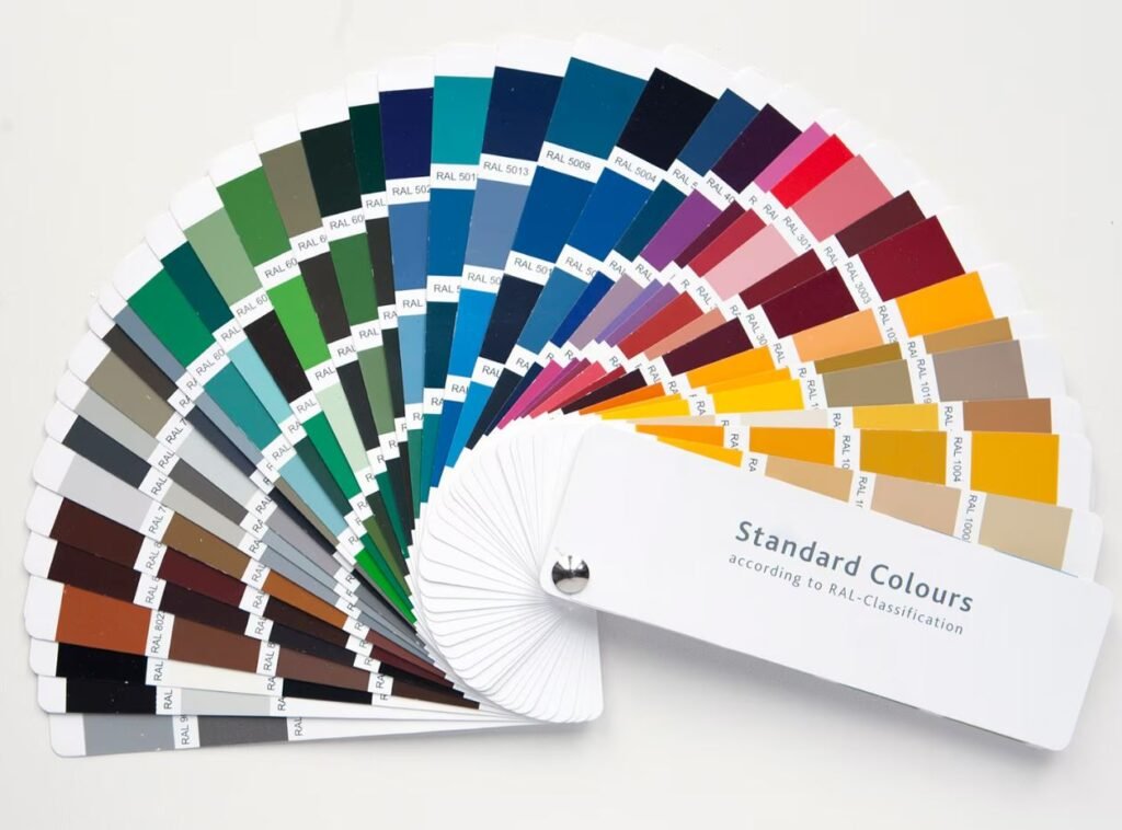
The colors you select influence not only the aesthetics but also the mood, energy, and perceived size of each room. Whether you’re crafting a serene retreat, a lively gathering spot, or a focused workspace, mastering the art of color selection is key to creating your ideal ambiance.
Consider this: 70% of homeowners believe wall colors directly affect their mood (Color Psychology in Interior Design). Colors can make a small room feel spacious or a large room feel cozy, evoke calmness, or spark creativity. This guide will walk you through everything you need to know …color psychology, key factors, 2025 trends, tools, and mistakes to avoid to confidently choose paint colors that elevate your home.
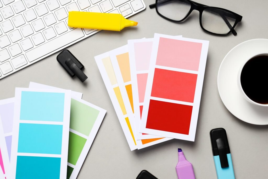
Why Choosing the Right Colors Matters
Colors do impact how you feel and behave in your home. Research in color psychology reveals that hues can trigger specific emotions, making your color choices critical for each space.
- Blue and Green: Linked to calmness, these shades suit bedrooms and bathrooms. Studies show soft blues can lower blood pressure and promote relaxation (Verywell Mind).
- Yellow and Orange: These energizing colors boost creativity, perfect for kitchens or offices, though too much yellow may agitate.
- Red: Bold and stimulating, red enhances conversation in living or dining areas but may overwhelm bedrooms.
- Neutrals (White, Gray, Beige): Timeless and versatile, they create calm, spacious backdrops for any room.
Selecting the right colors ensures your home looks great and feels right.. think a soothing blue bedroom for sleep or a lively yellow kitchen for inspiration.
Before picking colors, reflect on your preferences and home’s identity.
Here’s how to start:
- Know Your Style: Do you lean toward bold hues or soft tones? Check your wardrobe or take a quiz like Havenly’s Style Quiz to clarify your taste.
- Match Your Home’s Architecture: Modern homes may suit striking contrasts, while rustic ones favor earthy shades.
- Define Each Room’s Mood: Want a cozy living room or a focused office? Colors should align with purpose, blues for calm, greens for balance.
- Build a Mood Board: Collect images, swatches, or natural elements (like leaves or stones) to visualize your vision.
Understanding Color Psychology
Color psychology explores how hues shape emotions and perceptions:
How Colors Affect Mood
- Blue: Calming and serene, ideal for restful spaces. Research highlights its ability to ease stress (Psychology Today).
- Green: Refreshing and natural, it balances any room. Sage is subtle; emerald adds drama.
- Yellow: Cheerful and uplifting, great for social areas, but use sparingly to avoid overstimulation.
- Red: Energizing and bold, it sparks excitement but can raise heart rates, best for active zones.
- Neutrals: Sophisticated and calming, they let decor shine and suit all spaces.
Warm vs. Cool Tones
- Warm Tones (Reds, Oranges, Yellows): Cozy and inviting, they shrink large rooms and energize social spaces.
- Cool Tones (Blues, Greens, Purples): Relaxing and expansive, they open up small areas and soothe.
Crafting a Balanced Palette
Use these strategies:
- 60-30-10 Rule: 60% dominant color (walls), 30% secondary (furniture), 10% accent (decor) for harmony.
- Complementary Colors: Opposites on the color wheel (e.g., blue and orange) add vibrancy.
- Analogous Colors: Adjacent hues (e.g., blue and green) ensure cohesion.
The color wheel, primary (red, blue, yellow), secondary, and tertiary hues will helps you mix and match effectively.
Key Factors to Consider When Choosing Paint Colors
Picking colors involves more than taste. Here are the essentials:
Room Size and Lighting
Size: Light colors (e.g., pale blue) expand small rooms; dark shades (e.g., navy) cozy up large ones.
Lighting:
Natural Light:
- North-facing: Cool light darkens colors; warm tones balance it.
- South-facing: Bright light enhances warm hues.
- East-facing: Morning light brightens; west-facing deepens with afternoon warmth.
Artificial Light:
- Incandescent: Warms colors.
- LED: True-to-life tones.
- Fluorescent: Cools hues. Test colors in your space’s lighting to see their true effect.
Existing Decor and Furniture
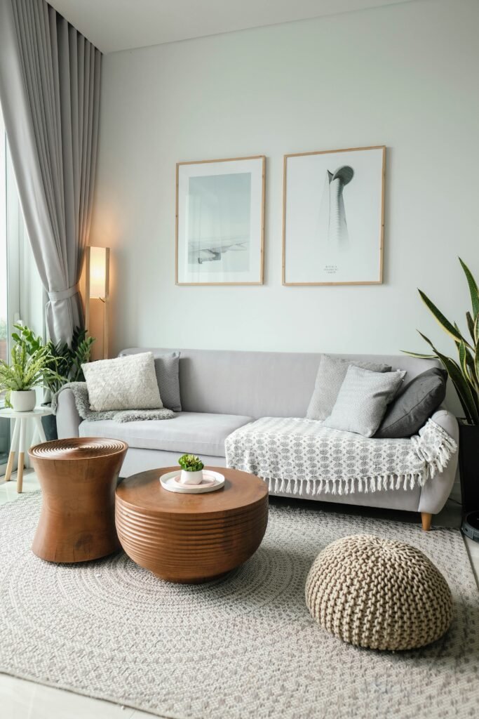
- Match or Contrast: Use a color wheel to complement (e.g., cool walls with warm furniture) or highlight key pieces (e.g., neutral walls with a red sofa).
- Finish Matters: Glossy paints brighten; matte tones soften.
Personal Style and Function
- Style: Classic loves neutrals; modern embraces bold hues.
- Function: Blues for focus in offices, bright tones for playrooms.
- Longevity: Neutrals endure; trendy accents update easily.
Balancing these ensures your colors enhance both look and livability.
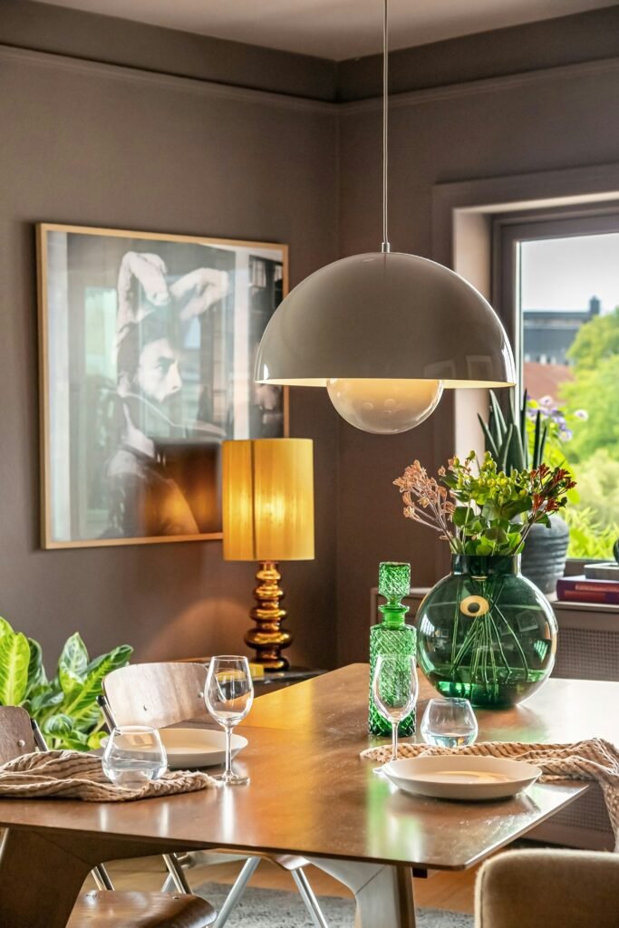
Popular Paint Color Trends for 2025
Trends offer inspiration. Here’s what’s hot for 2025, based on paint giants like Sherwin-Williams and Benjamin Moore:
Neutrals
- Whites: Crisp with warm or cool undertones for depth.
- Grays: Soft with blue-green hints for freshness.
- Beiges: Pink or peach-tinged for modern warmth.
Bold and Vibrant Colors
- Deep Blues/Navy: Sophisticated with green-gray twists for offices or dining rooms.
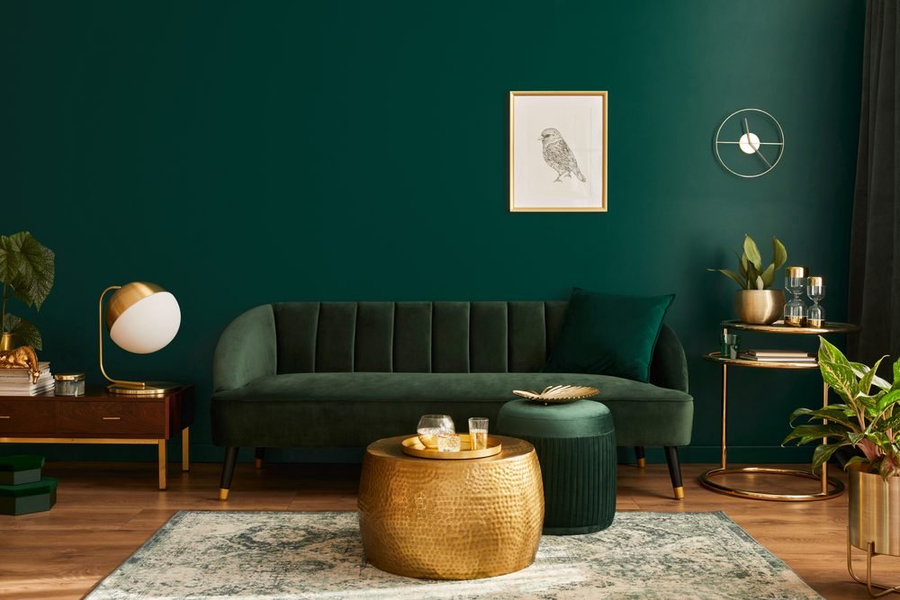
- Emerald Greens/Teals: Nature-inspired, versatile for living areas.
- Jewel Tones: Matte amethyst or ruby for luxe accents.
Earthy Tones
- Terracotta: Orangey-pink clays for cozy living spaces.
- Olive/Sage Greens: Calming, perfect for kitchens or baths.
- Sandy Beiges/Soft Browns: Gray-blue undertones for timeless calm.
How to Use Trends
- Accent Walls: A navy or terracotta focal point.
- Ceilings/Doors: Sage or teal for surprise.
- Accessories: Trendy hues in decor for flexibility.
Blend trends with your style for a fresh yet personal look.
Tools and Techniques for Choosing Paint Colors
With endless options, these tools simplify your choice:
Sample Testing
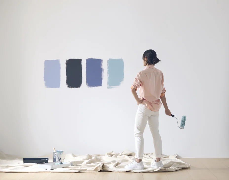
- Sample Pots: Paint 2×2-foot swatches on walls.
- Paint Boards: Moveable samples to test lighting and decor.
- Time Check: Observe day and night shifts.
Tech Tools
- Apps: Sherwin-Williams ColorSnap or Benjamin Moore’s Color Capture preview colors in your room.
- Visualizers: Behr’s ColorSmart tests combinations online.
- Virtual Consults: Expert advice from brands or designers.
Professional Help
- Designers: Cohesive schemes for big projects.
- Color Consultants: Tailored shade picks.
- In-Home Visits: Real-space insights.
Strategy
Start with inspiration (Pinterest, decor), narrow via apps, test samples, and consult pros if needed. This ensures confidence in your final pick.
FAQ: Choosing Paint Colors
What’s the best color for a small room?
Light colors are the way to go! Think soft whites, pale blues, or a cozy light gray. They bounce light around and trick your eye into thinking the room’s bigger than it is. Add a darker accent wall for some personality.. it won’t make the space feel cramped.
How can I make sure a color will work in my space?
You’ve got to test it out! Grab a couple of sample pots and slap a big 2×2-foot patch on your wall. Hang out with it for a few days and see how it looks in the morning sun, afternoon glow, and at night with the lamps on. Lighting can totally change the vibe, and trust me, a color you loved in the store might not feel the same at home.!
I love trendy colors, but how do I keep them timeless?
Trends are awesome, but they can fade fast. Here’s my trick: stick with neutrals like white, gray, or beige for your big spaces, they never go out of style. Then, splash those trendy colors into stuff like pillows, rugs, or a cool painting. It’s super easy to swap them out later without repainting your whole house. Think of it like switching up accessories instead of your whole outfit 🙂
Can I use the same color in every room?
Oh, for sure! One color everywhere can give your home a chill, unified feel great for open layouts. But if you’re scared it’ll get boring, play with different shades of it. Maybe a soft version in the hallway and a richer one in the living room. It keeps things flowing but adds a little spice.
How do I choose a color that matches my furniture?
Start with what you’ve got, check the undertones in your furniture. Is your couch warm and earthy or cool and sleek? A color wheel can help you find shades that play nice together. When in doubt, neutrals match pretty much anything. Test it out, too -hold paint swatches next to your stuff. I learned the hard way when a killer green I picked turned into a total mismatch with my sofa!
I’m stuck between two colors. What should I do?
Been there! Paint both on your wall and chill with them for a bit. Which one makes you happy when you walk in? If you’re still stumped, rope in a friend for a second opinion, or even chat with a color pro. Sometimes you just need someone else to say, “Yesss, that’s the one!”
Choosing paint colors for your house interior blends creativity and strategy. Understand color psychology, weigh size and lighting, explore 2025 trends, and use smart tools to craft a space that’s both beautiful and functional. Avoid pitfalls like skipping tests or trend overload for lasting satisfaction.
Your home reflects you… trust your gut, test thoroughly, and enjoy the process. For more, check Sherwin-Williams, Benjamin Moore, or Pantone. Happy painting!

